Our current project for GT is to take seven pictures of a landscape of our choice. HDR aka High Dynamic Range is a process that creates a clear scene to the eye by taking multiple contrast images. High Dynamic Range is used when your in the worst situation possible, you have the perfect shot and your at the golden hour of the day, but your camera sucks, and the balance of your colors are really uneven and the image looks extremely weird. I really like that instead of seeing really blurry and unbalanced photos the photos you've processed with HDR come out to be crystal clear and when you use HDR your photos turn out really detailed and amazing.
To create a final HDR image you need to follow these steps.
-Take 7 amazing photos from dark to light
-Import them to your device(make sure you have Photoshop)
-Go to Photoshop and click File>Automate>Merge to HDR Pro
-A pop up will come and you need to go to your folder and pick out the 7 photos
-Click ok, and Photoshop will do the rest
This is totally different from automatic HDR; when using auto HDR the device does all of the processing by itself you don't really have to do anything because the device is doing it for you. When you create an HDR image manually it feels like your actually learning something because you're going through the process of making the image, and not the device that uses auto HDR.
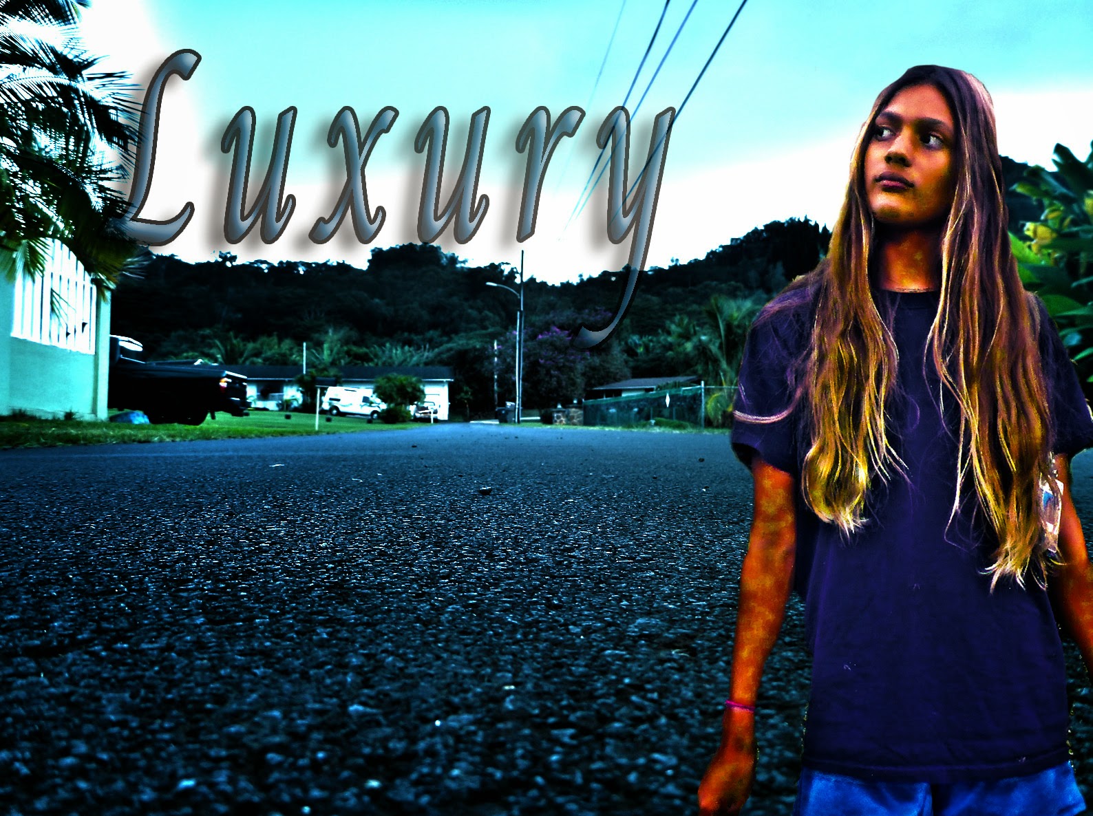
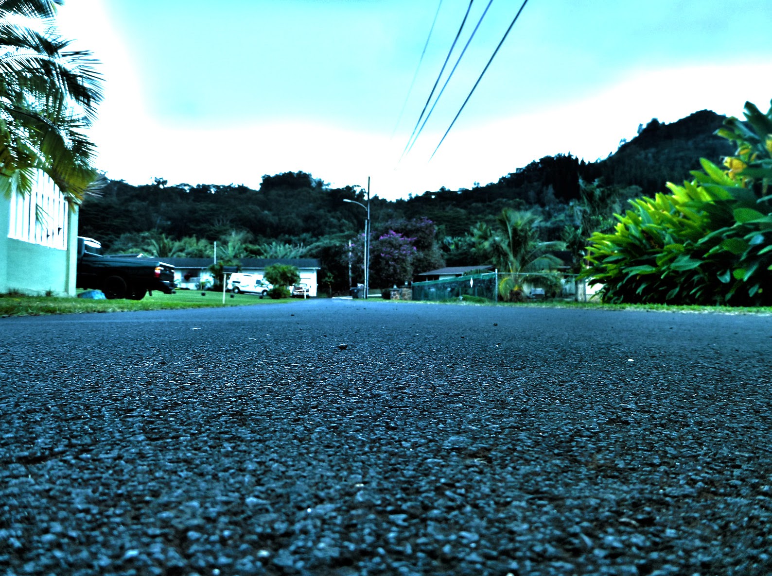 For my first photo, the HDR landscape, I knew I had a beautiful scene behind me, the sleeping giant, so I decided that since I have such a wonderful scene why not use this scenery to make an outstanding image. I really wanted a line that leads to somewhere (leading Lines) so, I thought of using my road as a line and I could get on the ground so that it would look like it was leading to my neighbors house. I also realized that by getting on the ground I would create sort of and unusual angle. I took my shots and thought they were really good so I kept them. For my other HDR image the HDR Experiment, I thought of getting my mom. I thought put my mom on the side of a vase with beautiful bright flowers to brighten up the portrait. I placed her in the rule of thirds, but I made the mistake of not giving her enough look room. I only realized that during Mr. Sanderls' class when he was critiquing my HDR Experiment.
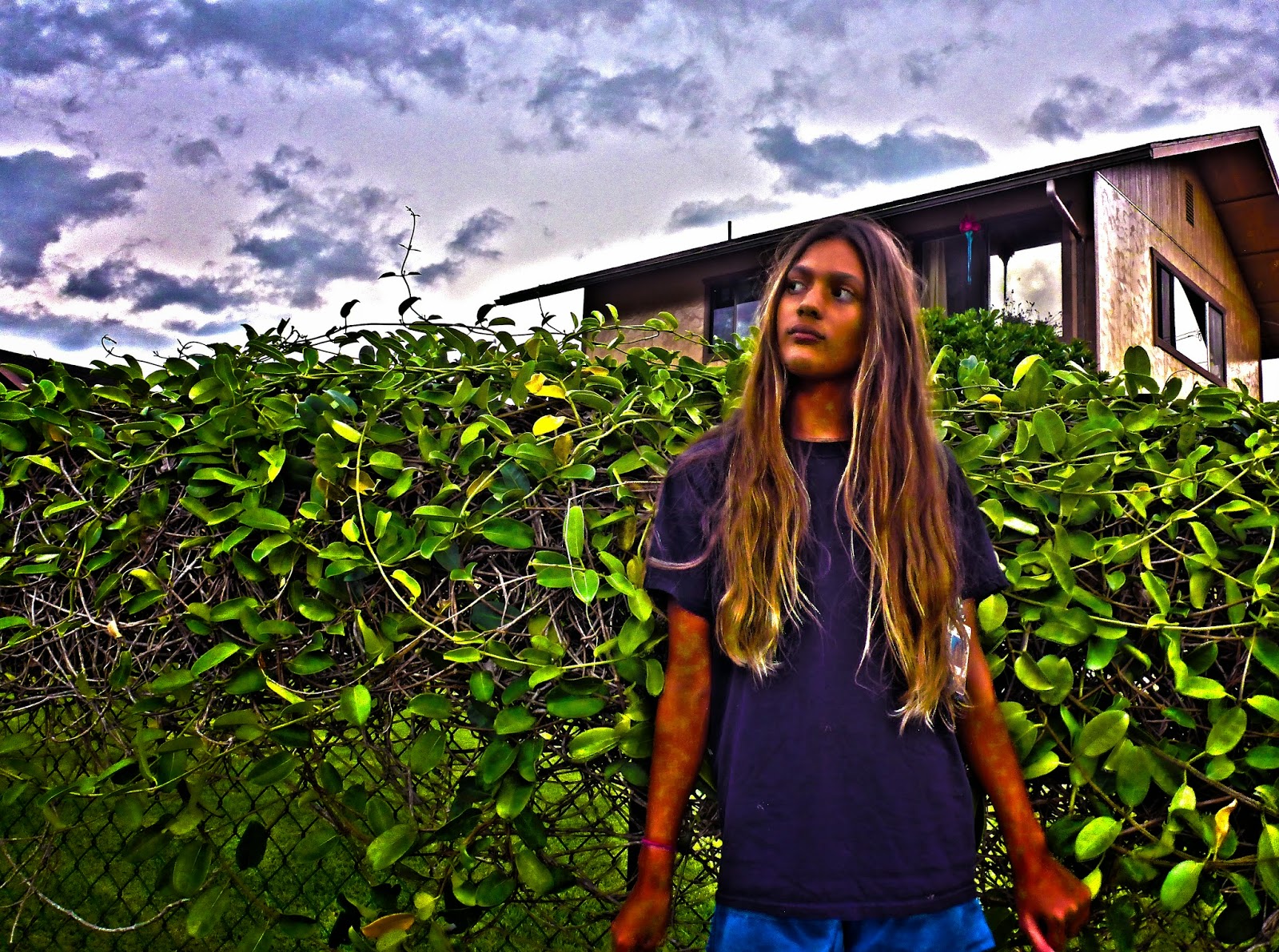
Very surreal!
ReplyDeleteYou can see through Lani's arm.
Great background!
I love the texture of the road!
ReplyDeleteI think Lani's arms could look more natural.
I like the text.
I love the texture of the road!
ReplyDeleteI think Lani's arms could look more natural.
I like the text.
cool landscape
ReplyDeletenot very realistic
the text matches well
super surreal
ReplyDeletecan see through her arms
cool backround
Good text.
ReplyDeleteMake her bigger.
Pretty good rule of thirds.
WHERE IS SHE? WHERE IS RACHEL?!?!?!
DeleteT_T Wow. Just Wow.
DeleteVery Surreal!
ReplyDeleteShe looks like a a ghost.
Great text.
It's surreal
ReplyDeleteI can see through the models arm
Nice landscape
really surreal
ReplyDeleteLani's arm could be fixed
the text really fits
I like how she is looking up
ReplyDeleteDoesn't look like she is actually there
Like the text
Love the surrealism
ReplyDeleteThe cut out could've done better
Very surreal.
ReplyDeleteThe word doesn't really go with it.
Nice rule of thirds.
Very surreal
ReplyDeleteHer arms are see through
Nice text
its surreal
ReplyDeleteShe looks like a ghost
i really like the text
1. Nice word of choice
ReplyDelete2. You can see through Lani
3. Great background
The road is a cool shot for texture
ReplyDeletevery surreal
ReplyDeleteyou can see straight through her arm
The text could be fixed a little
Very surreal
ReplyDeleteCould make the cut out better
Good landscape
Very surreal.
ReplyDeleteYou can see through Lani's arm a little.
The text font really fits the picture.
i love the clouds in the picture
ReplyDeleteMaybe you could have placed the text somewhere else
I really like the text
I like the way you colored your text.
ReplyDeleteThe cut-out quality could have been done better.
Your word itself is very surreal.
Your experiment is phenomenal.
ReplyDeleteMaybe work on your kerning.
Great rule of thirds.
Very surreal.
ReplyDeleteSee through arm.
Text could be better.
They are super surreal
ReplyDeleteShe's a G-G-G-G-GHOOOSST
Nice landscape
I like how you made the symbols realy match you
ReplyDeleteYou could of made less - space
I also liked how you blended it